
Bubblingbee International is a water company. The company produces table water (in 3 different sizes – 75cl, 50cl & 35cl) and dispensers bottled water. The goal was to create a visual identity and product branding (which included the art direction for the design of the bottle for the table water) that communicate the purity and essence of the products of the company.
A captivating identity that breaks the norm, gives room for the essence of the products to come to the fore and establishes trust in the consumer even on the first look.
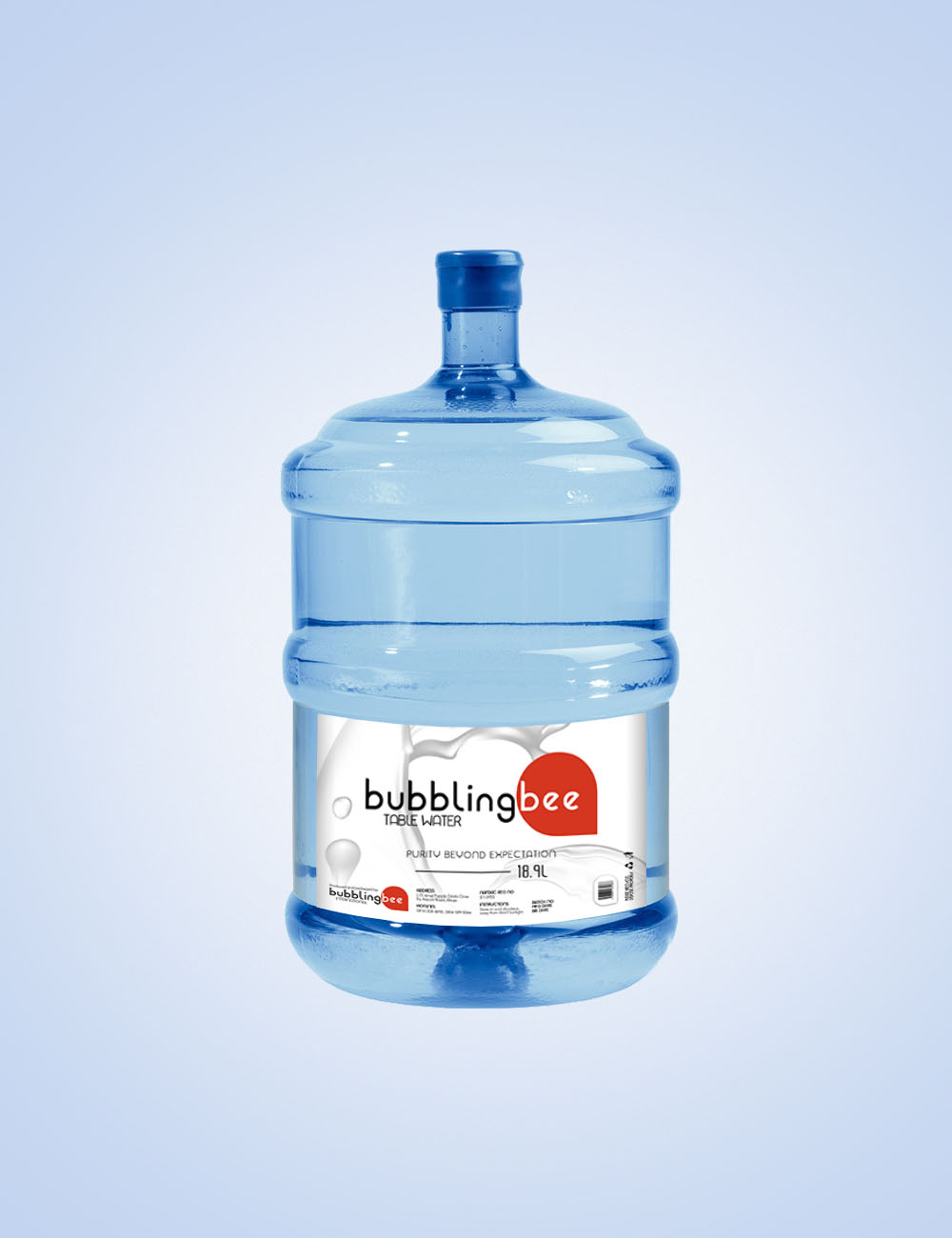
Table Water Bottle Mockup
Dispenser Bottle Mockup
The identity had to go in the direction of a wordmark logo that focuses on the name of the brand. It’s standard practice to have a wordmark logo in the beverage industry especially. This is because it helps the name of the brand to quickly become familiar to the consumers.
Also, being a brand that prides itself on the pure, clean, hygienic and healthy nature of its products, going with a minimalist and clean font that would communicate the purity and sparkling sense of the brand’s products to the target audience is an absolute necessity.

In this minimalist and clean logo, the negative spaces inside the letters b & g form a visual water drop shape that represents water. The same filled version of the water drop shape is seen underneath the “bee” word. The shape is functional in that it helps to accentuate and separate the word “bee” from the word “bubbling”, therefore, making the brand name easily readable and understandable, as well as making the brand name look concise and visible even when scaled down.
These all come together to project the brand’s purity and essence through a minimalist outlook.


This was a rebranding project as the previous outlook of the brand failed to clearly communicate the core elements and essential values of the brand.
So, being able to help Bubblingbee chart a clear pathway to showcase their products’ purity and essence absolutely hit the nail on the head for them.
Art Direction
— Kizo Daniels
Creative Design
— Kizo Daniels
Year
— 2020
My goal is the success of your project, and thus I bring my “A-game” of empathy, creativity, passion and devotion to the table for your project or team.
2 comments
Top notch work and a very simple but well detailed project
Thank you, Tomiwa.